From seven districts to one unified brand identity

Project Rebranding seven identities into one new brand identity
Scope Municipality of Amsterdam
Challenge Creating one uniform appearance for an entire municipality without reducing operational availability

Since 1990, Amsterdam had 16 different districts – each with its own administrative organisation. In 2010, this number was halved to the seven current districts, which were further reduced in their roles in 2014. With this further centralisation, the municipality had to present itself as one unified entity again. RGN had been involved since 2005 in developing and implementing the city’s branding, and this time, we ensured that the municipality operated with one consistent look. From the buildings to the vehicle fleet, everything now breathes the distinctive Amsterdam identity.

Gebouw van de Gemeente Amsterdam met het logo met de drie kruizen bevestigd aan de gevel
Group 79
Stadsloket Gemeente Amsterdam met een signing paal

The challenges

The transition to a uniform brand identity for the municipality posed several challenges:

  • Merging seven different brand identities into one
  • Creating a uniform look across the entire municipality
  • Rebranding all vehicles without reducing operational capacity
  • Supporting the internal organization throughout the entire process

One city, one face: a uniform brand for clarity and recognition

By standardising the brand identity for all districts, the municipality aimed to create clarity for residents, visitors, and other stakeholders; one point of contact for the entire city. For buildings, this meant consistent signage and a uniform, recognisable style. All vehicles had district-specific features removed, with the iconic triple Andreas crosses applied in a consistent manner.

De drie rode kruizen als het logo van Gemeente Amsterdam bevestigd hoog op een gebouw

Planning complexities

With over 700 vehicles requiring a new brand identity, precise planning was crucial. Our priority? Ensuring that all vehicles remained fully operational during the rebranding. Thanks to our network of local partners and a wide availability of the rebranding locations, we were able to organise the project flexibly. This allowed us to give the entire fleet a unified look without disrupting the operational availability of either vehicles or personnel.

Innovative tooling

In a rebranding project of this scale, effective tooling is essential. It helps us maintain oversight and supports our project managers throughout the entire process. A detailed registration also provides a solid foundation for managing and maintaining the fleet. In case of damage, it’s immediately clear which branding set is needed to restore the vehicle to its original Amsterdam look after repairs. This way, the Municipality of Amsterdam can always present itself as a strong, unified brand.

Curious how we can add value to your brand? Feel free to contact us!

 
Implementation
From two identities to one monolithic brand
 
Implementation
Nine brand identities transformed into one powerful BMN identity
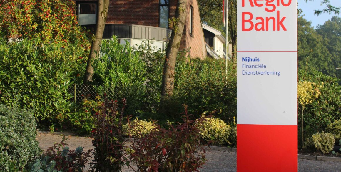
 
Implementation
From decentralisation to unity across 1,250 locations
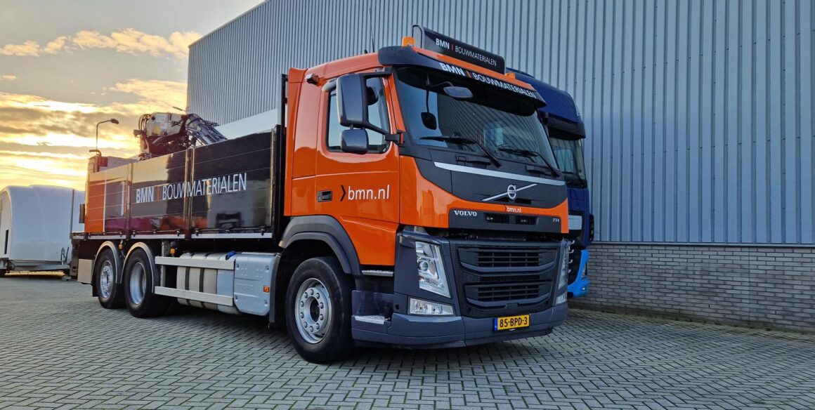
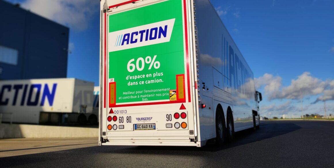
 
Implementation
918 vehicles and 216,000 containers transformed
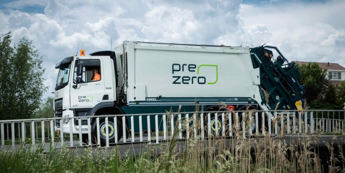
 
Implementation
150 vehicles and equipment rebranded in the new style
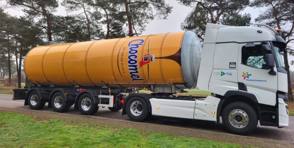
 
Implementation
25 tank trailers transformed into moving Chocomel cans
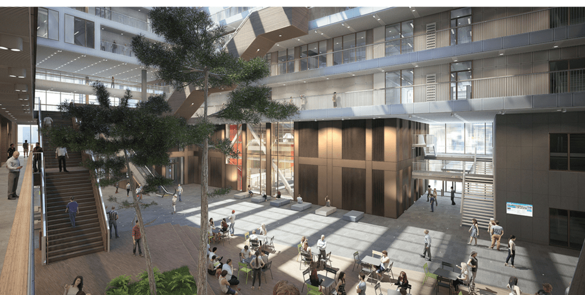
 
Implementation
From design to a real-life brand experience at the office
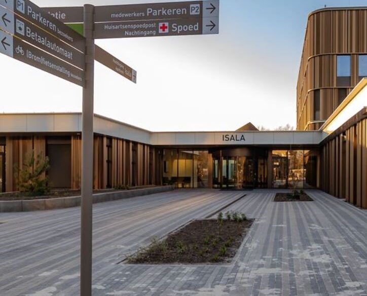
 
Implementation
Complete wayfinding system for the new hospital in Meppel
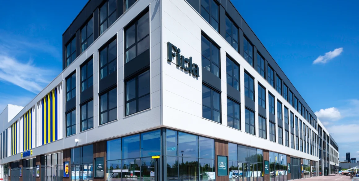
 
Implementation
From design to implementation in a 14,500 m² headquarters
 
Management
From design to 6,000 signs across 18 floors
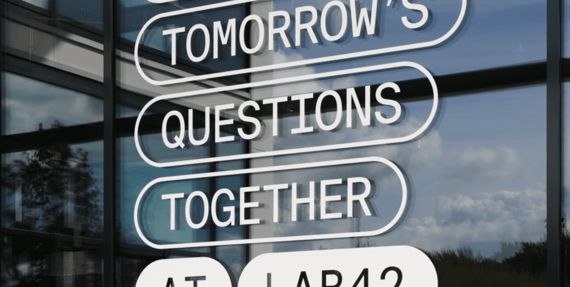
 
Implementation
A Transparent Vision on Privacy and Interior Branding
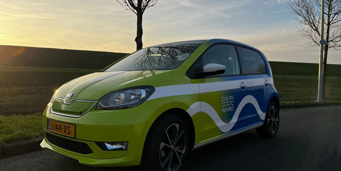
 
Wagenpark
750 vehicles in 10 countries within 4 months
 
Implementation
Repositioning and visual upgrade across 200+ locations
 
Implementation
One-of-a-kind hotel concept translated to multiple international hotels
 
Implementation
The Greetz feeling as a red line in the 'employee' branding
 
Implementation
Rebranding 800 vehicles without downtime
 
Implementation
Campus feeling for nearly 30,000 students attending VU Amsterdam
 
Implementation
25 years of fleet and signage brand management
 
Management
Innovative, academic-style wayfinding and signage
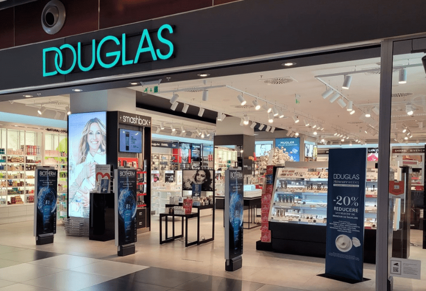
 
Implementation
Effective instore campaigns for 600+ stores worldwide
 
Implementation
In-store campaigns across 75+ locations in Eastern Europe
 
Implementation
From TNT Post to PostNL: a rebranding at national level
 
Implementation
Rollout of the new brand identity across 300+ stores
 
Implementation
A strong brand as a foundation for effective positioning
 
Implementation
From seven districts to one unified brand identity
 
Orientation
Gaining control over fragmented brand expressions across 100+ European locations
 
Implementation
500+ locations, one strong brand identity
Is your brand also ready?Send a message and we'll get back to you as soon as possible.
Or call us now at +31 88 987 99 00